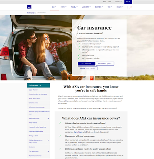
Problem statement
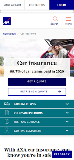
The existing car insurance landing page had a low engagement rate, lacking self-service functionalities and a clear call to action for generating new quotes or logging in.
My involvement in the project
As the UX Designer and Researcher, I led user testing, analysed behaviour via Google Analytics and Decibel, facilitated workshops, and delivered A/B test designs.